Front Cover Textual Analysis 1
Denotation
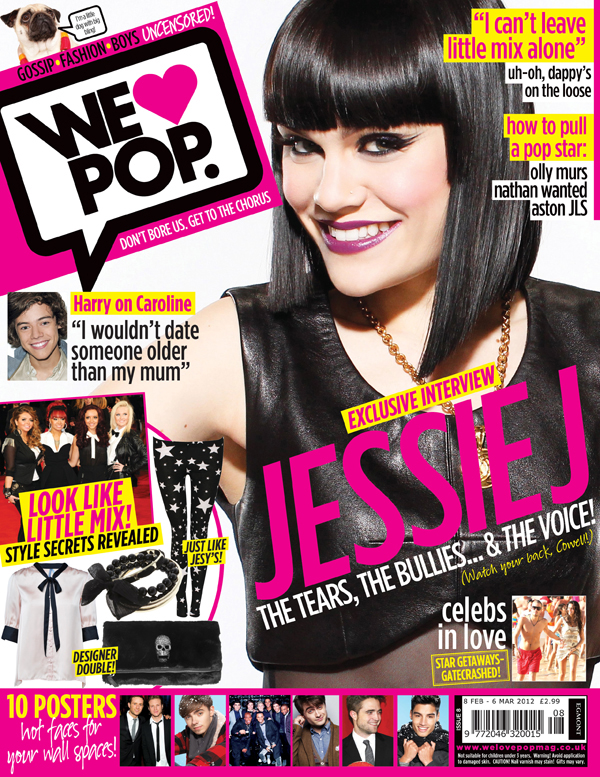
This magazine shows a medium close-up photograph of Jessie J looking directly at the camera. The front cover also features other celebrities, that are placed all around the page. The background of the page is white. The masthead is on the top left corner of the page. There are also five cover lines and one main cover line which is white and yellow.
Masthead
The magazines masthead is in black sans serif font in a contrasting white speech bubble, allowing the masthead to stand out and catch the readers eye. The sans serif font makes the masthead look modern so it appears to teenage girls and younger generations. The speech bubble masthead also appeals to the magazines target audience because it resembles a text message which teens can relate to because there often thought to be texting.
Character
On the front cover of this magazine the main image is of popular British singer Jessie J. Jessie j has a wide fan based not only in the U.K. But worldwide. This magazine would appeal to young teenage girls because Jessie is portrayed as "fun" and " edgy" which are traits girls can relate too. Overall the magazine try to show how current they are and how well they know there audience and there interests.
Costume: Jessie is wearing a leather crop top and a gold chain, confirming her edgy. Hip persona. Making teenage girls think she is cool and different from you typical "girl next door" pop star. Her bright purple lipstick is the only pop of colour the celebrity is wearing, but makes her seem spontaneous and fun to readers because of the unique choice of makeup.
NVC: In the main image Jessie J is smiling brightly, so she comes across friendly and and open. This would appeal to teenage girls because they feel like they could get to know Jessie personally and have a friendship with her.
Setting/ lighting: The background of the main image is white which could be interpreted as a blank canvas. Almost as if Jessie j has the tools and creativity to mark her own path. The lighting used makes the celeb look radiant, as if she is glowing. This could have been used to foreshadow her bright future.
Cover-lines
The main cover line on the magazines front cover "The tears, The bullies...& The voice". This would appeal to teenage girls because many teens experience bullying and would be able to relate to Jessie's story and how she overcame and became the pop star she is today. The main cover line also says "watch your back, Cowell". This I fairly small and can easily be missed, like a secret message to the reader.
Another cover-line on the front cover includes 1/4 of one direction harry styles on his relationship where he says "I would date someone older than my mum". This quote would make the reader want to by the magazine as Harry styles is a "heartthrob" and many teenage girls would like to know what he likes in a girl.
Target Audience
It is clear that the target audience of this magazine is teenage girls as there is a fair amount of feminine colours like pink. The fact that the magazine features a popular pop icon insists that teenage girls are the target audience.
Front Cover Textual Analysis 2

Denotation
The front cover of this magazine is a mid-range shot main image of a female. she looks straight ahead into the camera with no facial expression. Other celebrities are featured on the cover (left third). The background of the page is as sheer grey curtain, the masthead has been placed at the top of the page and the cover-lines
Masthead
The main image on the magazine is overlapped by the masthead, this is slightly uncommon for a commercial pop magazine to do so however it does follow the conventions of a pop by magazine by the placement at the top of the page. The white, sans serif masthead contrasts against the sheer grey curtain background.
Character
On the front cover of this magazine, the main image is of British singer Lorde. She is a new up and coming alternative/pop singer. This would appeal to an audience of teenagers because she is a "fresh face" on the music scene and offers a different sub-genre to anyone else on the charts.
Costume: Lorde is dressed like a teenager on this cover, wearing a simple t-shirt and what looks to be like black jeans. This makes her very genuine and would make audience feel like they could relate to her and her music.
Her makeup reflects the same "simple" image as it looks natural, this not only mirrors her personality but her cool, calm and collected music too.
NVC: In this main image Lorde looks directly at the camera, She hardly has emotion in her facial expression once again reflecting her personality. This may be appealing to the magazines target audience due to the unique persona presented, instead of the general cheesy celebrity smile.
Lighting/Setting: Sheer curtains have been used to create the background of the cover, creating a light and airy indie theme. The lighting used when taking the image is minimal however the model has a slight glow to her skin.
Cover-lines
The main cover-line on this magazine is "Lorde all hail the queen of teen"
Another cover-line is "2014's hottest fashion trends". This would be appealing to teens as a majority of teen girls care about fashion and there appearances therefore they would be interested in seeing what is popular at that point in time.
Target Audience
From the front cover of this magazine it is clear to see that the genre of this magazine is pop from the usage of the colour pink and white which are white feminine colours that would attract the target audience.
Barcode
The barcode is underneath the masthead making it easy to scan when being bought. This is the same case for the price which is also located underneath the masthead so that a potential buyer can easily find the price of the magazine.
Contents Page Textual Analysis 1

This Denotation
This double page spread features an interview with British singer Olly Murs. The main image of the spread is located on the right page but there are two other images of Murs on the left page. The colour scheme used on the page consist of blue, yellow and red. On the left side of the page is the text from the interview. Also on the spread; drop capital of the letter "O", a strapline, headline, a quote, columns and the subjects name.
Colour Scheme
The colour scheme of this spread is red, yellow and blue. The use if the colour red connotes Christmas which it would have been when this issue was published. Whilst the use of blue on the spread presents it as modern which would appeal to this pop magazines target audience of teenage girls. All of these primary colours combined symbolize emotion, positivity and intelligence, this reflects the portrayal of Olly Murs's personality and traits.
Image
On this double page spread there are three images of Olly Murs. The main image is located on the right page, this is also the biggest image which is usually the main attraction of a double page spread.
Character
The artist featured in this double page spread is 2009 X-factor runner-up, British singer and presenter Olly Murs. His fame is more national than worldwide so this magazines target audience would be most likely British.
Costume: Murs is wearing a plain red and blue varsity jacket and blue jeans in the first image however in the image he is in a dark cardigan with silver tinsel wrapped around his neck. The varsity jacket suggests he is youthful but simple and the tinsel from the second image makes the artist look like they enjoy a laugh which would seem relatable for the magazines target audience of teenage girls. Throughout this double page spread costume presents Olly Murs as your typical "boy next door".
NVC: His expressions in the shot is very happy, this again adds to the boy next door image that Olly Murs is well know for from his time on the x-factor and presenting on various UK shows.
Lighting/Setting: The lighting used in the main image is high key which protyayes him in a good light. Teenage girls would find him relatable with the building of Murs's boy next door approachable persona.
Headline
The headline "Merry Christmurs" has been conventionally placed in the top left corner of the double page spread. the font of
the headline is san-serif but bold, which has meaning of importance. The bold text could also reflect Olly's bold but bubbly personality .
Quotes
The quote on this double page spread is "Rylan walked around naked most of the time" This would be of interest to this magazines target audience because teenage girls seemingly love gossip. The quote slightly clashes with Ollys good boy portrayal but makes him seem like he has a naughty side which would be appealing to the target audience as he is letting them In which would make them feel included.
Strap-Line
the strap-line of this double page spread is "Oh it's a jolly 'olihay with Olly. And look who's pooping along- 1D, Si-co, Rita Ora and Flackers". This quote implies an Olly Murs Christmas takeover.
Subject Name
This double page spread follows the conventions of a general DPS by placing the subjects name relatively close to the main image. The subjects name was placed at the top of the right page. The texts are san-serif whilst the singers last name is in bold text however his first name comes across more personalised with the use of a softer font.
Double Page Spread Textual Analysis 2

Denotation
The main image on this double page spread is of British boy band the wanted. The image itself is placed between two pages. they look directly into the camera in front of a grey background. The colour scheme of the page is pink, purple and white
Colour Scheme
The colour scheme is pink, purple and white, these modern, feminine colours suggest the magazines target audience would be current (up to date) teen girls. All the colours in the colour scheme complement each other, giving the double page spread a fun but polished finishing look.
Image
The main image on this double page spread features U.K band the wanted, the image has a gym setting as two members of the band are holding dumbbells, Another is on gym apparatus. From the image the audience would assume that the boys are regular user of the gym and that they take care of there health, which would be appealing to teenage girls.
Character
On this double page spread the group featured on this page a world-wide band the wanted. The fact that this band feature on this DPS shows that the magazine a socially aware of new popular tends and what teenage girls like.
Costume: All the boys in the band are wearing plain, sporty clothes this ties in with, again suggesting that the boys take care of there health. This would motivate the magazines readers to get in shape, being more like the group.
NVC: In the image all of the boys are smiling which makes the boys seem friendly and open, This would appeal to teenage girls as the make up the majority of the bands following, they would also be more intrigued by the boys approachability and the fact that the feel they can relate to the band.
Lighting/Setting: The lighting used in this image has an high-key effect. The lighting portrays The wanted in a positive light, almost angelic, foreshadowing that the band will tell all and be truthful in there interview.
Headline
The headline "workout wonders" is placed top left corner of the double page spread, both words are in sans serif however the word "workout" is bold but "wonders" imitates handwriting which looks like an added touch by The Wanted themselves, This makes the wanted come across as if they care about the fans enough to put there own personal touch on this double page spread. The sans-serif font reflects the boys easy-going personalities.
Quotes
All the members of the band have a quote on this double page spread. One member of the band, Tom says "we don't try to be anything we're not". This quote displays that the band embrace being themselves, this would not only appeal to teenage girls but it will also inspire them to do the same. Another quote from a band member that presents the band to the audience as relatable is when max says "I'd pig out in front of the TV".
Strap-Line
On this double page spread the strap-line is "who's top of the PE class? And who's got a sick note from their mum? We joined The wanted at the gym to find out!". From this the audience can interpret the context of the interview being
Target Audience
As this is a double page spread out of a pop magazine, I think the target audience would most probably be teenage girls around the age of 13-16.
